Tuesday, September 10, 2013

Children's books that promote simplicity

Recently, I stumbled upon a study conducted by a University of Vermont student who analyzed how 30 award-winning and best-selling children's picture books promote materialism to young readers. It got me thinking about the books that I've been reading to my own children, aged 5 and 2.5. It's true that a good many books focus on "stuff," and how great it is to obtain more stuff. So I wanted to highlight just a couple of books we've read in the last few months that present a different message:

The Biggest House in the World

by Leo Lionni

I'm a big fan of Leo Lionni. My mom read him to me when I was little... and I've bought just about every title for my three boys. Lionni's illustrations are always captivating. The storylines are always simple. And the messages are usually just the sort of lesson I want to teach my kids. In this case, a little snail longs for a bigger, better house until he hears the fable of an older, wiser snail about a snail who spent his all to create an outlandishly huge and beautiful shell. The house was big and beautiful enough to draw the attention of other garden creatures, but the snail was unable to move and eventually the snail was "left behind, and with nothing to eat he slowly faded away. Nothing remained but the house. And that too, little by little, crumbled, until nothing remained at all." After hearing the tragic end, the little snail proclaims he'll keep his own shell light and spend his life exploring the world. I think this message of valuing adventures more than things helps combat materialism by showing how the quest for more stuff keeps us from truly enjoying life.


Blackout

by John Rocco

I discovered this book at our local library. The dramatic cover drew me in, and it doesn't hurt that it sports a Caldecott Honor medal on the front. The illustrations and text are set up almost comic book style, telling the story of a typical urban family of four in frames. A little child-- I can't quite tell if the kid is a boy or girl-- seeks partners to play a board game, only to find that Dad is busy cooking, Sister is on the phone, and Mom is clacking away at the computer. Suddenly, the lights go out in their apartment building and across the city. The summer heat drives the family to the roof of their building and eventually to the streets, which have become vibrant with candlelit conversations, communion and celebration of the simple pleasures of the city at night. Eventually the lights come back on and everyone returns to their original occupations, but the little child turns out the lights and the family happily comes together to play the board game. This book is valuable because it shows a situation to which most families can relate. Technology and busyness keep us from connecting with the ones we love... and sometimes an imposed "fast" from these distractions is all it takes to regain the joy of spending quality time together. My boys also enjoyed the story and requested it a few nights in a row.

Tuesday, June 4, 2013

"The Way to Obey" Available on Amazon and Kindle!!


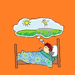
This is the file I used for both the front (right) and back (left) cover of my very first published children's book.

I'm excited to announce that The Way to Obey -- a.k.a. "The how to listen book" as Stephen calls it-- is available as a 24-page paperback on Amazon.com. Last I checked, Amazon had marked it down to $6.18 and is offering the free supersaver shipping.

If you're more digitally minded and only want to spend 99 cents, you can also get the ebook for Kindle and read it on your smartphone, iPad, Kindle... whatever device you use :). A few friends have already downloaded it and used it in their evening devotions with their preschoolers.

I would loooove to have some honest, thoughtful reviews for the book on Amazon. hint, hint. :)

My other news is that I'm going to start building up this blog, hopefully with my well-read husband, Joe, to include reviews of other books, discuss new book ideas and share sample chapters/pages from other Parrino books that we're writing :)

Thursday, October 18, 2012

Still fumbling around, but enjoying Jesus in the process


Hello again. Here's a redone page one.... black is C:0 M:0 Y:0 K:100... dunno how to get it any blacker :) I've used ArtWeaver. Trying my best to get the resolution up, but the help section of this freeware is not exactly robust. This image should be 300 dpi... but I had thought that several re-do's ago and was wrong. I didn't see your comment, PAB, until I'd done it at 300. Will that print OK?  I enlarged my original to 2500 x 2500 pixels (to compensate for the 96 dpi resolution) then traced it using layers... and deleted the original layer and flattened everything into a jpg. I'm resigned to not being completely professional... as long as the quality doesn't distract from the message for the kiddos.

Saturday, October 6, 2012

Obey! Please comment :)

This is the book I'm creating for Stephen and Rockam. called "Obey". I'm posting these early images (a little less than half of the book) so that my artsy friends can give me some advice, pointers, etc.!

Background
A little about the book... I began this project because I've been working on teaching Stephen how to obey... right away, all the way and with a cheerful heart, as the Christian parenting mantra goes. I realized there was a lot to obeying with the right attitude... and as these thoughts simmered in my mind, out popped a picture book that I hoped would be humorous and enlightening for my favorite little book lover. The words and ideas for the pictures pretty much came over the course of a week. Actually producing the images has been a much slower process... For more on this, read my previous post.

God’s word says I need to obey my mom and my dad. But how should I obey?

Should I be messy and careless when I obey?

No! I should always be neat and do my best.

Should I be grumpy and pout when I obey?

No! I should have a cheerful heart and say “Ok!!”

Should I obey later?

No! I should be quick to obey right away.


Should I cry or complain when I obey?

No! I should always be willing to do what mommy and daddy say.

Should I get angry when asked to obey?
(Speech bubble says: Share with your brother, please!)

No! I should be peaceful and pleasant.
 
 
I've been struggling with keeping the little boy's look consistent. He started off with a really round, fat head. Later, he started to look a little more realistic. Many of the images above are substantially altered versions of their former selves. Are there some images you like better than others? What about them do you prefer? Do you feel the inconsistency of the main character's look is distracting? Or am I making too big a deal of it?

Background of the Obey book

More about the "Obey" book, if you're really interested.

About the Art(ist)
Some of you might know that I took a lot of art classes in high school.... er... nearly 20 years ago. I always liked art, but after high school I ceased to practice drawing. When I attended the grad program in journalism at UIUC in 2005, I took a news graphics course that reminded me how much I loved design. That led to a job as a designer and editor at a local newspaper... I feel that I can probably hone my skills into something workable, but I really need lots and lots of work. That's why I'm opening up these pages for discussion, pointers, constructive criticsm and just friendly encouraging (or friendly discouraging) comments.

About the Style
I'm in love with a lot of children's book illustrators' work. I grew up with the beautiful collage-like quality of books by Leo Lionni and the whimsical visions of childhood in Gyo Fujikowa's "Oh What A Busy Day." Some of my recent favorites are the bold, bright pictures in books by Lucy Cousins and Leslie Patricelli. My kids really like these kinds of illustrations too, so I was aiming for this kind of simple, colorful and cartoonish feel.

About the Medium
I'm not endowed with a budget that allows me to purchase Adobe Illustrator... and I'm paginating this book in my 7-year-old InDesign CS ....with no numbers after it. SO ... these illustrations are done in MS Paint. And saved as PNG files... (??) I know. Crazy and stupid. But I couldn't wait to start sketching, and Paint is what I have on my computer. So, there's no layers. There's no vectors. No bezier tool. I'm just using the "crayon" brush and sketching freehand, using my laptop's touch pad. I tried the mouse, which sucked. I have a really old Walcom tablet (seriously, from high school) but it has a legacy plug.

The text
I've written the text below each image. It will actually appear in the blank space above the picture. I'd love to purchase FF Providence Sans for this book, but might end up settling for the free "Kristin ITC" that's on my computer already. It's a step up from the font all designers love to hate, Comic Sans. This book is meant to be an 8.5 inch square. The font size will be 24 or 30 in black.